


Choosing colours according to the room
The colours that are chosen to furnish the home hold immense power as they have the ability to stimulate different feelings in us depending on the room.
It is therefore essential to know how to harmoniously combine the different furnishing elements in the home in order to create a cosy and familiar environment.
In reality, however, the choice of colours is a very subjective and personal matter. Each of us loves some finishes and hates others. Therefore, in order not to make mistakes and to identify the best match, we reveal some tips to follow.
The 3-colour rule: 60% – 30% – 10%. What does this mean?
This rule involves combining a maximum of 3 different shades to furnish your home. Generally, a dominant colour is chosen at 60% which can be used for the walls and the most voluminous furniture. 30% is the second shade chosen, which must contrast with the predominant colour. This contrast between the two shades creates depth and movement. The remaining 10% is the shade that catches the eye and stands out from the other two. This percentage is used especially for details.
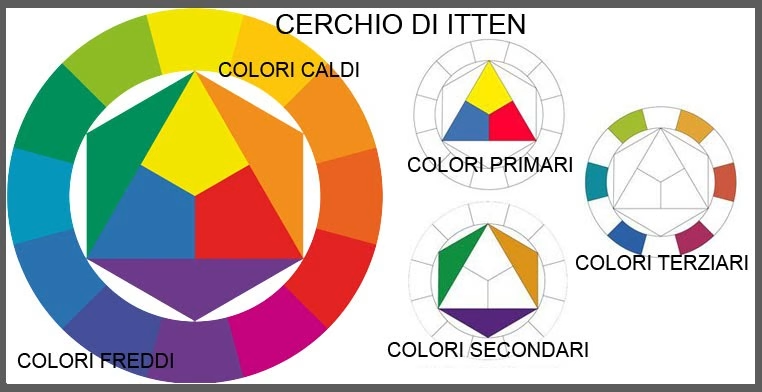
Another method for combining colours: the ITTEN circle
With this method, potential colour combinations can be evaluated and determined.
The inventor of the Itten circle is the painter, designer and writer Johannes Itten, who classified colours into primary, secondary and tertiary.
How does it work?
In the centre of this circle, a triangle is drawn in which the 3 primary colours (yellow, red and blue) are inserted. These colours generate the secondary colours i.e. orange, green and violet placed in the adjacent triangles. Orange is the result of the fusion of yellow and red; green is the result of the fusion of yellow and blue; violet is the result of the fusion of blue and red. Thus a hexagon is formed inside the circle in which there are the 12 tertiary colours that are obtained by mixing primary and secondary colours.
The basic rule of this circle approves the combination of colours that are in opposite positions and rejects the combination of colours that are close to each other, but excluding white and black.
See explanatory image.
How to match colours to the room:
Bright and strong finishes are preferred and recommended in the kitchen. In fact, the kitchen is considered the room where one can dare, so the advice is to choose bright colours. On the contrary, for the sleeping area, delicate colours are preferred that conciliate rest and give tranquillity.
Chromatic psychology
As we know, colours hold psychological significance and influence us in our decisions when it comes to buying one product rather than another. In fact, it is essential to point out that it is not possible to find a 100% objective meaning for every colour, but we can say that some colours have a universal meaning as shown in the figure below:

Furthermore, the male gender generally prefers colours between blue and green with high saturation. In contrast, the female gender prefers colours between red and purple with low saturation.
Finally, warm colours increase adrenalin and make us perceive time more slowly, while cool colours tend to calm us down and make us perceive time more quickly.